We’ve all been there. You have multiple directions you can take and you need to decide how to prioritize. We’ll take an imaginary example of choosing a project to prioritize, but the same can apply to choosing a security or investment strategy, or anything else for that matter.
So… You have 3 projects to choose from with different potential outcomes, so you do the logical thing. You get everyone together in a room and you spend a whole hour discussing and putting together the following scorecard for your options:
| Option | Impact Higher = More Impact | Effort Higher = Less Effort | Cost Higher = Less Cost | Score Higher is Better |
|---|---|---|---|---|
Project 1 | 7 | 6 | 5 | 18 |
Project 2 | 10 | 2 | 1 | 13 |
Project 3 | 4 | 8 | 7 | 19 |
Great! This says you should do Project 3 first. You’re done right?
But wait a minute, does that make sense? It has the least Impact!
Your Score looks off… Maybe you have to do a weighted score to clarify that you care about impact more.
Here we go… Let’s add some weights.
Impact: 0.5 Effort: 0.3 Cost: 0.2
| Option | Impact Higher = More Impact | Effort Higher = Less Effort | Cost Higher = Less Cost | Score Higher is Better |
|---|---|---|---|---|
Project 1 | 7 | 6 | 5 | 7 (0.5) + 6 (0.3) + 5 (0.2) = 6.3 |
Project 2 | 10 | 2 | 1 | 10 (0.5) + 2 (0.3) + 1 (0.2) = 5.8 |
Project 3 | 4 | 8 | 7 | 4 (0.5) + 8 (0.3) + 7 (0.2) = 5.8 |
Ok… That’s better, but now how do you choose between Project 2 and Project 3? Project 2 has an Impact of 10, but has the same score as Project 3. What should you do?
Maybe you calculated your scores wrong… You spend another hour with the team and try all kinds of variations:
- Maybe Score = (Effort ⨉ Cost) + Impact
- Maybe your weights aren’t actually right, let’s rejig them
- Maybe you’re missing another column altogether, something like Strategic Fit.
How do you know that this scoring mechanism even works?
I don’t know about you but I have serious doubts about any decision we made using scorecards after going through so many iterations adjusting weights like that.
To be clear, I’m not saying there’s no valid combination of scores that actually correlates with ideal outcomes, but when was the last time you actually checked that correlation?
In fact, there are so many things wrong with this approach that it might even be driving you to make worse decisions than just a pure gut feel. Let’s explore all the ways things can go wrong.
Problem 1 – Bad Math
Ordinal Values
Believe it or not, the scores you assign aren’t quantitative values. They are what are known as ordinal numbers. This means that the value 4 is more than 2, but not necessarily twice as much as 2. The math of addition and multiplication that you’re used to simply does not apply to ordinal values. Adding and multiplying these numbers has unintended consequences and will more likely add errors to your analysis ¹.
Problem 2 – Extreme Rounding Errors
Range Compression
Let’s say one of your evaluation columns is the return on investment. You may assign 2 projects the score of 5 on return on investment (ROI), but in reality one of the projects may have 3x higher ROI. When you’re using an ordinal scale, you have no choice but to map the underlying real-world values to a small range of numbers. This “compresses” the range of possible outcomes in a way that does not reflect their real-world distance. The range compression effect is something ordinal scales suffer from and they can get amplified if you’re t-shirt sizing or using a small scale like 1-5.
Problem 3 – Ambiguous Labels
The Illusion of Communication
Although everyone was nodding when you say something like “Impact”, these words mean completely different things to different people. Maybe “Impact” means “revenue” to a CFO, or maybe it means “Reduced Downtime” to an engineer. Even if you Agree on your definitions upfront, there is so much variation in people’s perspectives that you can never really derive the same exact meaning.
Similarly, who’s to say that a score of 4 for me is the same as a 4 for you? If we’re talking about costs, I could be thinking $10,000 and you could be thinking $20,000 and we’d never know the difference cause we seemingly agreed with each other.
Even if you clearly define and document rules for what constitutes each value of the scores, your decisions will still suffer from range compression, mentioned above.
Problem 4 – Avoiding Extremes
Centering Bias
To make matters worse, people tend to have a centering bias² causing their responses to fall around only a few values, compressing the range even further! You might notice this phenomenon when you see around 75% of the values fall between 3-4 on a 5 point scale because the participants were “reserving” the most extreme outcomes.
Problem 5 – The Biggest Problem of All
Pseudo-Quantitative Results
The biggest trouble at the heart of scorecards is that they don’t represent quantitative values you care about.
Do I care about a score?
No, I care about profit, risk, costs, etc. Instead of making up a number to represent those things, we can actually measure and model the values we’re actually interested in!
Does your project increase efficiency? Quantify the actual time saved by employees.
Does your strategy reduce the risk of failure? Measure that in expected dollars lost.
What to do instead
There are a number of alternative techniques you can use to model such decisions. While the level of complexity is slightly elevated, at least they won’t add more error to your analysis.
Slightly Better – Sum of Z-Scores
The simplest modification you can make is to make a small transformation to your scores to convert them to standardized z-scores. We take the values for one attribute among all of the evaluated options and creates a normalized distribution for it so that the average is zero and each value is converted to a number of standard deviations above or below the mean. Finally, all the numbers are added up to the final result.
Initially proposed by Robyn Dawes, This method removes some of the problems with scorecards associated with varying scales of the input attributes (for example, if Impact is on a scale of 1-5 but cost in on a scale of 1-10).
Let’s see it in action for our example above.
- Convert your attributes to cardinal values instead of ordinal scores. For example, for “Impact”, “Effort”, and “Cost”, we could use “Additional Revenue”, “Implementation Time” and “Cost of Implementation” estimates. This alone will greatly improve the decision from this model because you are less susceptible to the effects of ambiguity, range compression, and centering bias. For the sake of simplifying comparisons, I will keep the scores as they are.
- Compute the mean of each attribute across all items. For example, mean Impact in excel would be calculated as
=AVERAGE(4,10,7) = 7
- Compute the standard deviation for each column. You can do this in excel using the formula
=STDEVP(4,10,7) = 2.4
- For each value in the column, calculate the z-score by subtracting the mean and dividing by the standard deviation
- The final outcome for each column is a score as low as -3 and as high as +3. Simply adding these up will give you a better relative score you can use to compare options
| Option | Impact Higher = More Impact | Effort Higher = Less Effort | Cost Higher = Less Cost | Score Higher is Better |
|---|---|---|---|---|
Project 1 | (7-7) / 2.4 = 0 | (6-5.3) / 2.5 = 0.28 | (5-4.3) / 2.5 = 0.28 | 0 + 0.28 + 0.28 = 0.56 |
Project 2 | (10-7) / 2.4 = 1.25 | (2-5.3) / 2.5 = -1.32 | (1-4.3) / 2.5 = -1.32 | 1.25 - 1.32 - 1.32 = -1.39 |
Project 3 | (4-7) / 2.4 = -1.25 | (8-5.3) / 2.5 = 1.08 | (7-4.3) / 2.5 = 1.08 | -1.25 + 1.08 + 1.08 = 0.91 |
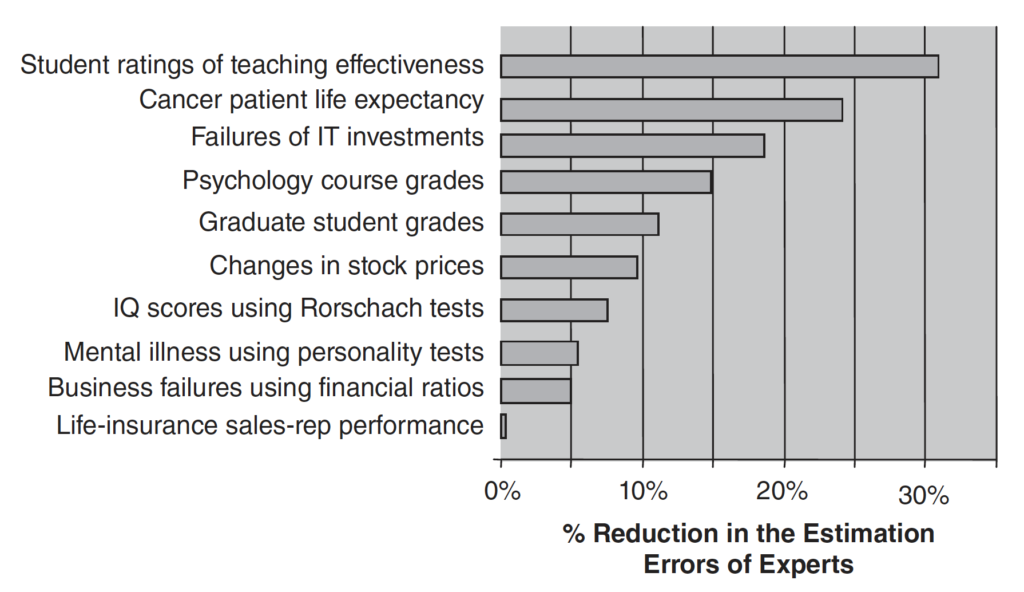
It is fascinating that even though we’re not applying additional weights to the attributes and just adding them up as-is, even this straightforward model often outperforms human experts at unstructured evaluation tasks, like clinical diagnoses or college admissions.
Slightly Better – Lens Models
Human experts are incredibly inconsistent in their evaluations. Even in identical situations, the same expert will provide a different evaluation 10% to 20% of the time! We humans can also be thrown off by completely irrelevant variables while still maintaining the illusion of learning and expertise.
Fortunately, we can counteract this inconsistency in judgements by building simple models that will completely remove the variations in decisions. Experts can be used to identify the factors that may be important in making those judgements, and we can let the model decide the importance of those factors!
By simply providing experts with a list of scenarios (real or generated) and asking them for their evaluations or predictions are given only the selected factors, we can make a model of that expert’s judgement. For example, A simple linear model for the potential ROI of an IT project, fit on the input from expert evaluations, can yield a such as
ROI = Weight₀
   + Weight₁ ⨉  Months of Existing Experience With Technology
   + Weight₂ ⨉  Development Time
   + Weight₃ ⨉  Historical Demand
   + Weight₄ ⨉  Cost of Software
   + Weight₅ ⨉  Number of Potential Users
   + Weight₆ ⨉  Rate of Adoption
What is remarkable is that such simple linear models have been shown to improve the decision performance over unstructured decision-making even if the weights are excluded (as was the case with the previous method) or astonishingly, randomized (as long as we bake in whether each variable has a positive or negative impact)!
The lens model has been applied successfully in many industries and studies indicate a significant reduction in error in most cases.
Best – Monte Carlo Simulations
For the best predictive performance, you can model your decision by baking in your model’s relationship between different variables. What do I mean?
Imagine you operate an e-commerce store, and you’re evaluating 2 features that can improve your sales conversion rates through different means. You want to calculate the potential impact on profits for these options by formally modelling the features’ effect on your funnel.
Feature 1 increases revenue by sending emails to customers who abandoned their shopping cart and costs $620 a year to operate.
Feature 2 increases revenue by showing an additional product (upsell) before checking out. This feature costs $5000 a year to operate.
Which of these 2 is going to perform better? You have to break it down.
For Feature 1, the breakdown may look something like this:
Feature 1 Net Profit = Added Revenue/Year - Cost/Year of Feature 1
where
Added Revenue/Year = (
  # Carts Abandoned/Year
  ⨉ Average Price of Product
  ⨉ Percent of Users Opening the Email
  ⨉ Percent of Users Clicking the Link
  ⨉ Percent of Users Finishing the Transaction
)
Using your own data and the average numbers from your industry, you plug in some numbers
Feature 1 Net Profit = (5000 carts ⨉ $25 per product ⨉ 15% opened ⨉ 30% clicked ⨉ 25% bought) - $620 = $786.25
Similarly, here’s the breakdown for Feature 2
Feature 2 Net Profit = (# Checkouts/Year ⨉ Avg Upsell Offer Product Price ⨉ Percent of Users Accepting Offer) - Cost/Year of Feature 2
Plugging in the numbers, you get
Feature 2 Net Profit = (10,000 checkouts ⨉ $30 per product ⨉ 2% bought) - $5,000= $1000
Feature 2 is the clear winner here, right? Maybe, but unfortunately, you made some assumptions that might not necessarily be true.
Just plugging in average values isn’t going to give you the full picture. Each one of the variables you used as input to your model has a range of uncertainty associated with them. The average numbers you used may give you completely unreliable results if, for example, you had a few outliers driving the average up.
The more robust way to include those variables is by defining their distribution over possible values and taking thousands of samples or “scenarios” from each variable, and running them through your formula.
This way, instead of getting a single number for Net Profit, you will get a distribution of possible profits. This method of modelling using random samples is called Monte Carlo Simulation. Here’s what it might look like if we do this for Feature 1?
Feature 1 Distributions
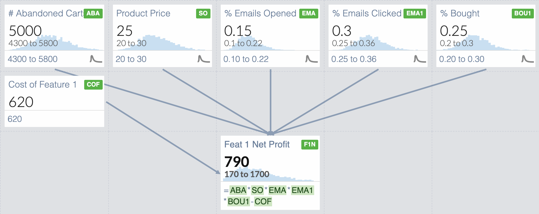
Once we include our uncertainty surrounding our variables, even though our input averages are the same as the previous iteration of our model, our Net Profit can range from $170 to $1,700! Of course the likelihood of each value differs, and the Net Profit only falls in that range 90% of the time (based on how I’ve set up the simulation), but now you have an idea of what a best and worst case scenario might look like.
What about Feature 2?
Feature 2 Distributions
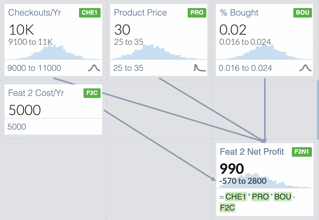
The Net Profit for Feature 2 ranges from -$590 to $2,400. What is interesting is that the average of all these scenarios is actually the same as the Feature 1 average of $790, instead of the $1,000 we originally got with our naive model. We have a bigger profit, but also a bigger risk. You can actually lose money on this one!
At this point, you have the ability to decide whether the extra risk is worth the reward. You can ask questions like, “What is the probability that my Net Profit will be more than 0?”
You can also combine these 2 simulations in interesting ways.
What if we asked “How often is Feature 2 Better than Feature 1?” or “By how much, on average, will Feat 2 be better than Feature 1?”

We can see that 55% of the time, Feature 2 would more Net Profit than Feature 1. We have also quantified that it would be $180 more profit on average.
If you are okay with the risk associated with a range of possible outcomes for Feature 2, you can decide to accept that as your preferred option. If not, you may decide to reduce your uncertainty by taking additional or better measurements to more precisely quantify your inputs such as # Checkouts/Year or % Bought. In doing so, however, your distribution might shift towards the lower end of the previous distribution.
For example, if by further measurement I’ve reduced my uncertainty for Feature 2, the picture changes completely!
Assume that my 90% confidence interval for the # of Checkouts is now 9,500-11,000 instead, and % Bought is now measured to be 1.6 to 2%.
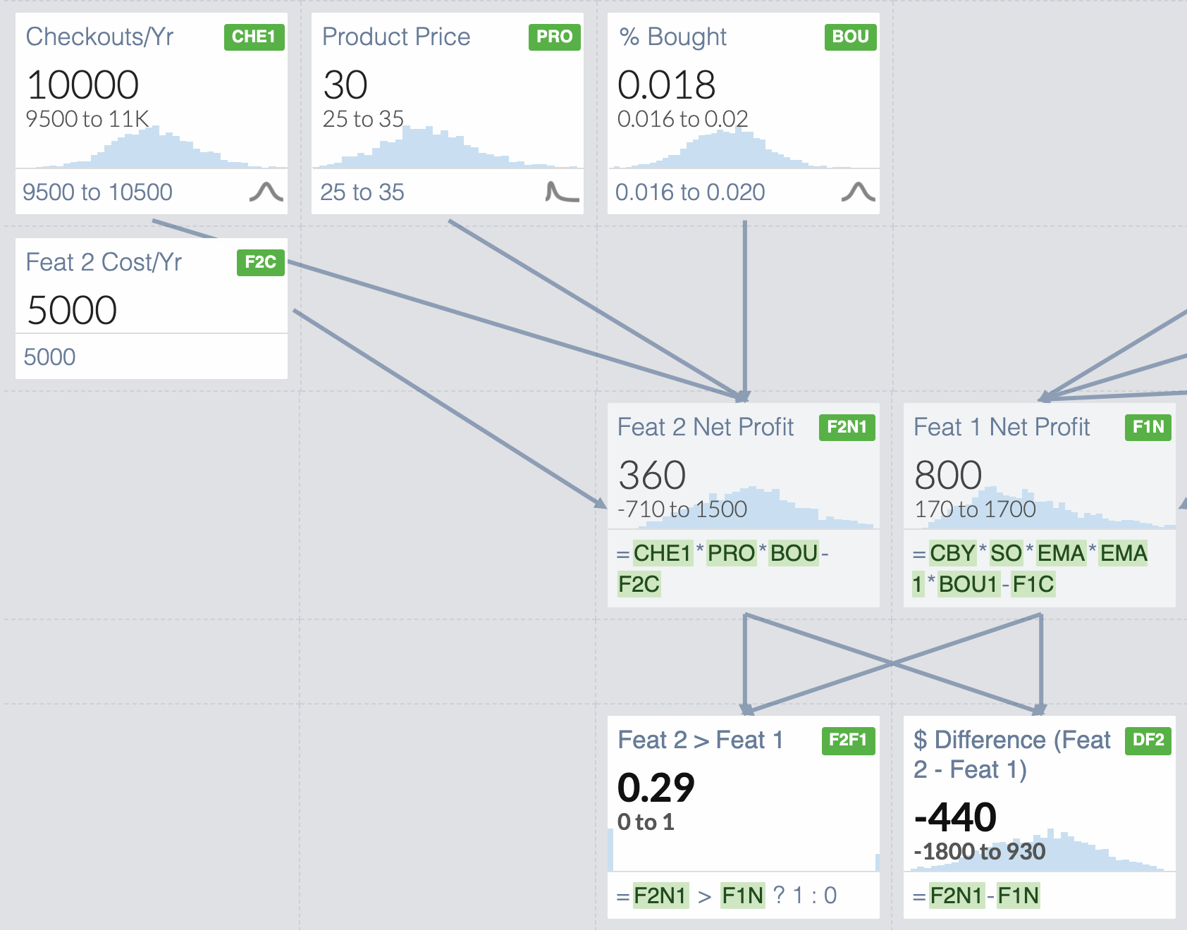
Now that we have reduced our uncertainty, Feature 2 does not look so good anymore. We can only expect it to outperform Feature 1 29% of the time and on average it would yield $440 less Net Profit than Feature 1.
Notice that, using Monte Carlo simulations, we have elevated our analysis to a much higher level than we could with scorecards. You can now talk about risks and probability of outcomes and expected return to make a confident decision. You can reduce your risk by doing further measurements. You can decide how much effort or money you want to spend on reducing your uncertainty.
This is just scratching the surface of using Monte Carlo simulations for decision-making. This concept is extremely powerful and opens the door to make many better-informed decisions in your business. Best of all, you can easily do it within excel for free without the addition of any complex tools. Make sure to subscribe to the Data Digest to catch my in-depth guide to Monte Carlo simulations in Excel, coming soon!