Hello, savvy readers!
Today, we’re diving deep into a beloved metric that’s been a mainstay in the customer experience arena: the Net Promoter Score (NPS). A simple, seemingly powerful number, NPS has promised insights into customer loyalty and satisfaction. But is it the North Star it’s made out to be? Let’s peel back the layers.
What Exactly is NPS?
Before we critique, let’s understand. NPS is calculated by asking customers a single question:
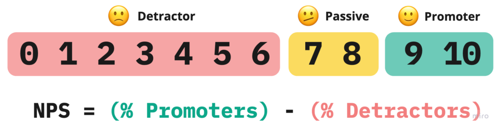
On a scale from 0 to 10, how likely are you to recommend our company/product/service to a friend or colleague?
Based on their responses, customers are categorized as Promoters (9-10), Passives (7-8), and Detractors (0-6). The score is then computed by subtracting the percentage of Detractors from the percentage of Promoters.
Sounds simple, right? However, simplicity is both its charm and its curse.
Throwing the Baby Out with the Bath Water
Consider Company A and Company B, both with an NPS of 30. Company A has 55% Promoters and 25% Detractors, indicating a polarized customer base. Company B has 35% Promoters and 5% Detractors, showing more moderate spread across the spectrum, indicating a more uniformly satisfied clientele.
They both have the same NPS score, yet entirely different customer stories are masked beneath it.
Consider the 3 potential distributions of scores below:
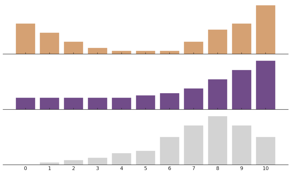
All 3 cases have the same NPS score of 0. Each one, however, tells a completely different story and would surely lead to a different reaction.
NPS does not shed any light on the distribution of your survey results, potentially obfuscating any systematic shifts in your users’ experience.
Keep the Signal, Not the Noise
Measuring customer satisfaction through NPS reveals a level of variability that goes beyond common expectations. This isn’t a mere coincidence but a fundamental aspect rooted in the method of calculating NPS.
Central to NPS are two groups: Promoters (P) and Detractors (D). These groups are dynamic, meaning their percentages fluctuate with each new survey, a phenomenon attributed to sampling variations. These dynamic values are what statisticians call random variables. The calculation of NPS isn’t just about tallying these percentages; it involves subtracting 2 random variables, which has interesting consequences on the variability of the final result.
To understand this better, let’s delve into a key statistical concept: the variance when subtracting two random variables, like P and D, isn’t straightforward subtraction. It’s calculated as:
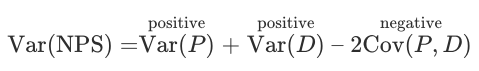
In this equation, Var signifies variance, which measures the spread of survey results. Cov, or covariance, assesses how two variables, in this case, Promoters and Detractors, move in relation to each other. If these groups were entirely independent, their covariance would be zero, making the variance of NPS just the sum of their individual variances. However, the reality is more nuanced.
Typically, there’s a negative covariance between Promoters and Detractors. This means when the percentage of Promoters increases, that of Detractors often decreases, and vice versa. This means that the negative covariance effectively becomes a positive addition to the overall variance of NPS (because subtracting a negative number is equivalent to adding a positive one), thus increasing the total variance of the Net Promoter Score, making it larger than the variance of either group alone.
Below is a simulation of the width of the 90% confidence intervals for each measure as we scale up the Sample size. Note that the NPS score always has a wider range than the variables it’s comprised of.
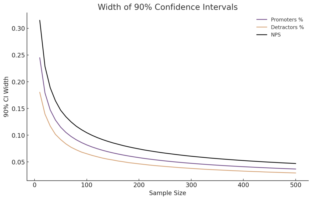
Why does this matter? Well, a higher variance means more uncertainty in the measure of NPS. Business decisions made on the basis of NPS are therefore subject to this uncertainty.
Let’s say your Net Promoter Score (NPS) hops from 30 to 40 between surveys. Hold the confetti 🎊— this jump might just be the statistical shuffle of NPS itself, not a true shift in customer sentiment. Even if the average (mean) or middle value (median) of your customer ratings stay consistent, the way NPS combines Promoters and Detractors can cause your score to swing unexpectedly. Keep this in mind to avoid needless worry or unwarranted strategic pivots based on these normal statistical ebbs and flows.
Actions Speak Louder Than Words
NPS measures the intention to recommend, not the actual referral behaviour. A study by East et al. (2013) showed that the correlation between intention and actual behaviour can be weak. For instance, while 70% of customers might express a high likelihood to recommend, only 20% actually do. This gap between intention and action can lead to misinformed strategies based on optimistic projections.
Moreover, people’s feelings towards a brand aren’t binary, as NPS suggests. They’re more intricate—someone might recommend a brand in one instance and criticize it in another, reflecting the multifaceted nature of customer experience.
A study by C Space, highlighted in Harvard Business Review, illustrates this point. It revealed that 52% of individuals who actively discouraged others from a brand had also recommended it. This suggests that NPS may overlook the complexity of customer relationships, leading to potential missteps in strategy if used in isolation
Alternatives to NPS
While the Net Promoter Score (NPS) provides a snapshot of customer loyalty, it’s not the only gauge you should rely on. Even when you do use NPS, often, the gold lies in the follow-up—the “Why?” This is where customers give you the narrative behind their scores, offering invaluable qualitative feedback that can drive actionable change.
The simplicity of NPS can be appealing, but the complexity of customer loyalty demands a more careful approach. There are some popular alternatives to NPS that have gained popularity in the recent years.
NPS-Adjacent Metrics: Enhancing Your Approach
When confronting the statistical complexities of NPS, a slight modification in your strategy can be highly beneficial. Instead of relying exclusively on the NPS score, explore these refined variations:
- Distribution Visualization: Get a clearer picture by visualizing the full spread of your customer responses. This allows you to see not just the extremes (Promoters and Detractors) but also the nuanced opinions in between.
- Mean or Median Analysis: By summarizing your data through statistics like the mean (average) or median (middle value), you gain a more stable and reliable understanding of overall customer sentiment, beyond the limitations of the NPS calculation.
- Top and Bottom Score Proportions: Focus on the proportion of high (scores of 8-10) and low (scores of 0-3) responses in relation to the total number of responses. For example, track the percentage of top scorers (Promoters) over time to monitor trends in customer satisfaction.
Each of these methods provides a deeper, more comprehensive view of your customers’ feedback, enhancing the insights you can derive from the traditional NPS approach.
CSAT: The Satisfaction Indicator
Customer Satisfaction (CSAT) is a tried and true measure asking customers to rate their satisfaction with a product, service, or experience. It’s usually quantified by a single question, such as “How satisfied were you with your experience?” with a corresponding scale, typically ranging from “very unsatisfied” to “very satisfied.” Research, like the one from the Journal of Marketing by Anderson, Fornell, and Lehmann (1994), shows that CSAT can be a strong predictor of customer retention, possibly because it measures direct reactions to specific interactions or purchases.
CES: Measuring Effort and Ease
Meanwhile, Customer Effort Score (CES) asks customers to evaluate the ease of their experience with a company. The central question might be “How easy was it to handle your issue?” with customers responding on a scale from “very easy” to “very difficult.” As this study in Harvard Business Review points out, CES can be more predictive of future customer behaviour than NPS because it directly addresses the ease and convenience of the customer experience, which is a crucial determinant of loyalty.
Complementing with Quantitative Methods: The Role of Customer Journey Analytics
In addition to these qualitative metrics, incorporating quantitative methods like customer journey analytics can provide a more holistic view. Customer journey analytics involves measuring actual user behaviour and interactions with your product or service. This method is grounded in the principle that actions speak louder than words – what customers do often provides a more accurate picture than what they say they will do.
- Benefits: Quantitative analysis can uncover usage patterns, identify features that drive engagement, and highlight areas needing improvement. It provides hard data on customer behaviour, complementing the subjective nature of NPS, CSAT, and CES.
- Limitations: While powerful, this type of analytics should not be used in isolation. It’s most effective when combined with qualitative feedback, as it doesn’t capture the why behind user behaviour.
Customer journey analytics with customer feedback metrics can lead to more informed decisions and improved product strategies. This approach is particularly useful for digital products, where user interactions can be precisely tracked and analyzed. However, it might be less applicable in scenarios where customer interactions are less digital and more personal, such as in certain service industries.
By leveraging both qualitative and quantitative data, businesses can gain a comprehensive understanding of their customers, leading to more effective strategies and, ultimately, business growth.
Using all the Tools in the Toolkit
Each of these metrics illuminates different facets of the customer experience. But the real magic happens when you look at them together.

- NPS offers a broad measure of loyalty and propensity to recommend.
- CSAT gives immediate feedback on customer satisfaction after an interaction.
- CES focuses on the operational aspect, highlighting how customer effort impacts loyalty.
- Customer Journey Analytics gives you indisputable evidence of what is happening in your business, allowing you to narrow your focus on problem areas.
By examining the scores in concert with one another—and by investigating the qualitative feedback, particularly the reasons and stories customers provide with their responses—we can get a detailed picture of where a business excels and where there is room for improvement.
In Conclusion
There you go, friends—while NPS can signal customer sentiment, it’s not the only star in the sky. To navigate the vast customer experience cosmos, occasionally switch telescopes and find a balanced understanding of where you stand with your customers. 🔭
For now, keep it simple, keep it real, and let multiple metrics chart your course.
Thanks for reading, and here’s to the insights that lie ahead!
How likely are you to recommend this article to a friend or colleague?