If you have ever worked with relational databases, you have probably come across situations where a join between certain combinations of tables has produced incorrect outputs. In some cases, we might catch these right away, but at other times, these issues escape attention until a user or customer notifies us of the incorrect results.
This has a high cost because trust in data systems is hard to earn and easy to lose.
When something like this happens, we usually scramble to fix the problem on a case-by-case basis, but if we pause for a moment, we can actually start to see that many of these issues result from certain patterns.
Two patterns that are common causes of these self-inflicted wounds are the fan trap and the chasm trap.
Doing some further research online, I noticed that I could find surprisingly little high-quality information about these patterns. Where you do find it mentioned, it is often inconsistently defined, unduly constrained, or overly complicated. Most importantly, I could not find an elegant or generic solution to these problems that was not tied to any particular software.
Luckily, I recently came across a book written by Francesco Puppini titled “The Unified Star Schema.” In that book, Francesco clearly identified the root cause of the fan trap and the chasm trap and proposed a new and innovative modelling method that solves both issues, in addition to many other challenges.
With Francesco’s blessing, I want to use this post as an opportunity to amplify the ideas presented in his book. The Unified Star Schema has a lot to offer, and I felt like the fan trap and chasm trap are good entry points to understanding the advantages of this new paradigm.
What is a Fan Trap?
In data modelling, a fan trap occurs when multiple rows in one table refer to a single key in another table containing measures, leading to a duplication of the measures in the final joined result.
A “measure” is simply a number, such as a sales amount or inventory count, that can be aggregated using arithmetic. Not all numbers are measures, however. For instance, a year is a number but not a measure, as we’d probably never sum or average two years in our analyses.
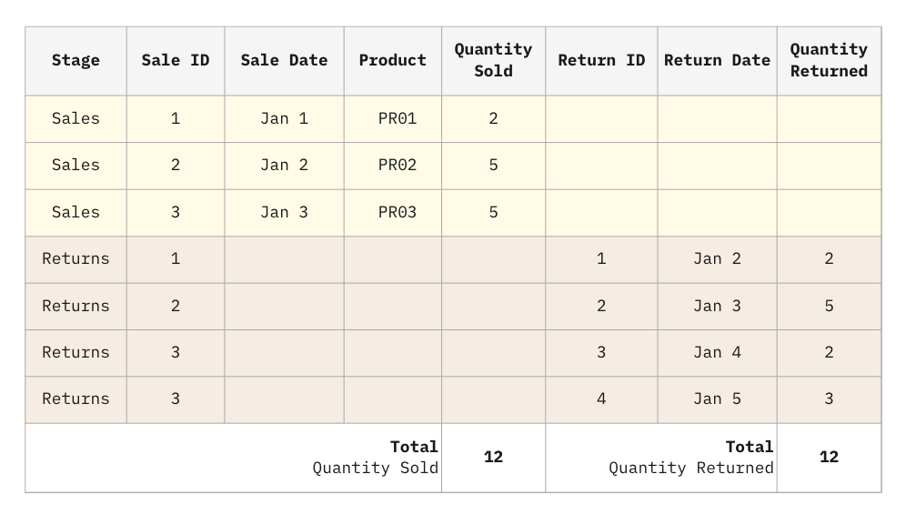
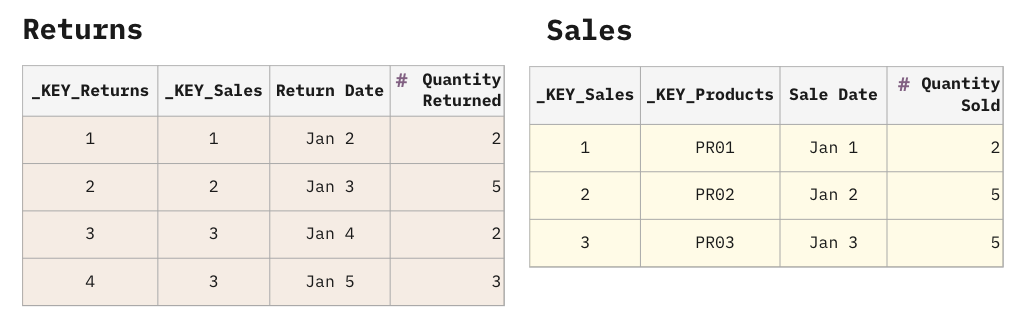
Let’s take the example of having many returns over some period of time for a single sale. The Returns table holds the foreign key to the Sales table.

The Returns table could have multiple rows referencing a particular row of Sales, hence duplicating the measures of Sales such as the Quantity Sold. Note that the Returns table can have measures too, such as the Quantity Returned, but that is not a requirement for a fan trap to exist between Returns and Sales. It may, however, become relevant if the Returns table becomes the target of another table with a similar many-to-one configuration, forming another fan trap.
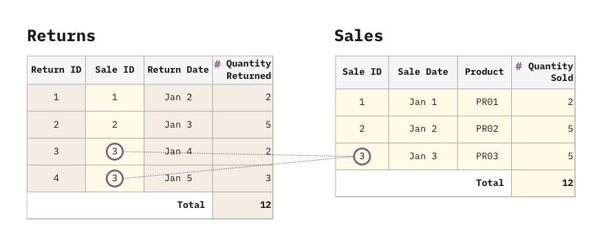
Ignoring the fact that our customers don’t seem to like our products, we can see that there have been 12 items purchased and 12 items returned.
What happens when we join these tables?
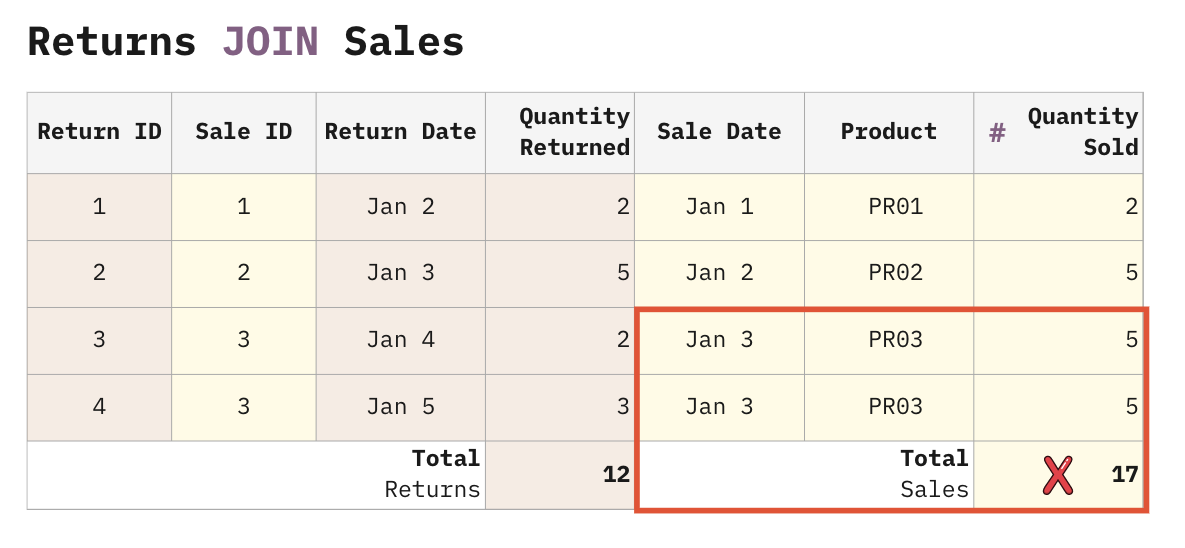
Oops… The rows from the Sales table got exploded by the Returns table rows. Unfortunately, even experienced analysts usually aren’t even aware this is happening and continue to build reports on this bad join. Most tools do not provide a warning when a fan trap occurs either.
As a result, the total Quantity Sold in the report appears to be 17, instead of the correct value of 12. Note that the reports based on the Quantity Returned, instead, will be correct. This is because the Quantity Returned comes from a table that isn’t exploded by any other table.
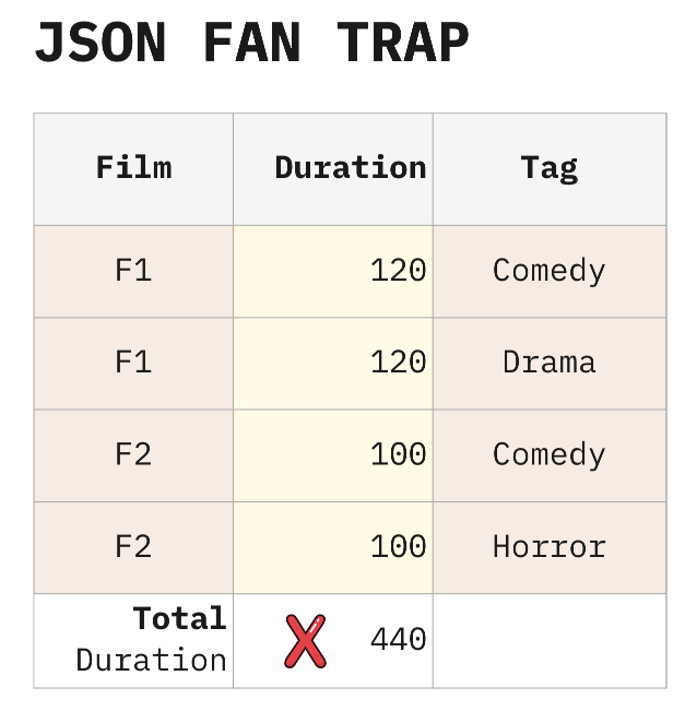
The fan trap problem is not unique to data existing in tables. It can also occur even when the reference to the target record with measures is implicitly encoded, as is common in nested structures like JSON or XML documents. Consider the results from this hypothetic movie API query returning tags for each movie.
{
  "results": [
    {
      "Film": "F1",
      "Duration": 120,
      "Tags": ["Comedy", "Drama"]
    },
    {
      "Film": "F2",
      "Duration": 100,
      "Tags": ["Comedy", "Horror"]
    },
  ]
}
It is fairly common to use a JSON flattening tool to import this data into a database, and what can happen is that the duration measure gets exploded by the tags.
What is a Chasm Trap?
The chasm trap occurs when a target table (referred to via foreign keys) gets exploded by 2 or more other tables, causing an effect similar to a cartesian product. Since the number of participating tables is unbounded and they all explode each other, the chasm trap can produce many more unwanted duplicates than a fan trap.
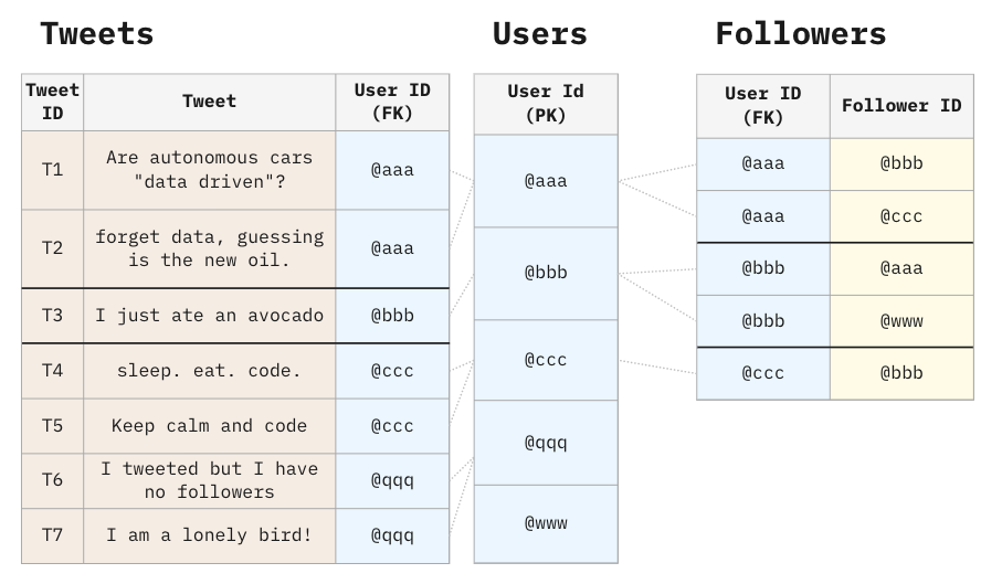
For example, consider the following data model representing Twitter:
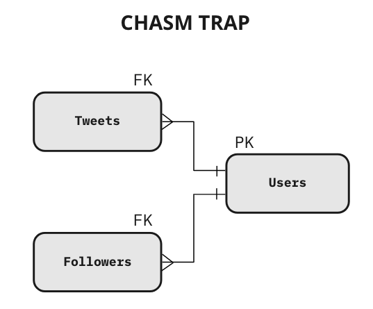
This data model is definitely correct in the database of an application because applications typically handle single operations at a time. However, in a database that supports Analytics (e.g. data warehouse), this structure presents a big risk. A SQL developer may safely create a query with Users and Tweets, as well as a query with Users and Followers. But if the query involves the three tables at the same time, the result will explode, and every measure (sitting in every table) will explode too, producing incorrect totals.
The problem occurs when a single row in the Users table simultaneously matches multiple rows in the Tweets table and multiple rows in the Followers table.
Let’s see what happens when we SELECT FROM Users and LEFT JOIN Tweets and Followers.
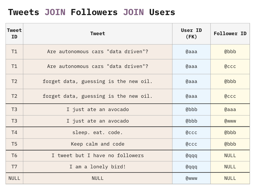
There is a cartesian product of each user matched in the tweets and followers tables. It’s not just the User rows getting exploded. Tweets are also exploding followers and vice versa.
It doesn’t matter what kind of join you do. If you use an INNER JOIN instead of a LEFT JOIN, the users @qqq and @www will disappear, but the remaining users will still have a Cartesian explosion caused by the chasm trap.
The explosion is only similar to a Cartesian. If it was fully Cartesian (obtained with the CROSS JOIN command), with 7 tweets and 5 followers we would obtain 35 rows. Instead, we only obtain 11 rows, because the Cartesian product only happens on a “user-by-user” basis.
But… Where does the number 11 come from?
It is fairly easy to derive a formula for the number of records you can expect from a chasm trap. You can even use this formula to automatically check for chasm traps in your automated data quality pipelines.
Below, you’ll find a chart that illustrates how you could pre-calculate the number of rows contributed for each user, based on our example. This calculation can be created before launching the query, and it can prevent us from producing a massive (and not really useful) resulting table.
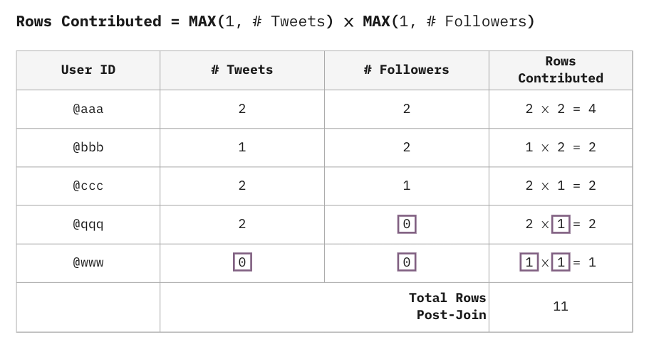
In the Twitter example, if every table has N rows, the lower bound on the number of rows in the resulting table is N, and the upper bound is N², because the Users table is targeted by 2 tables. In general, if the Users table is targeted by k tables, and they all have N rows, the resulting table will end up with an upper bound of Nk rows.
It’s not hard to imagine the cost of falling into a chasm trap. What’s even worse is that the referring tables can themselves be the target of other chasm traps, leading to an even bigger explosion due to the nesting effect.

As you can see, the chasm trap explodes the data volume without contributing additional useful information. This can really add up with large data volumes, leading to high costs of storing redundant data.
Things can get even worse when the tables contain measures. The duplication of measures is not only a system challenge but also a very serious semantic challenge because measures are very hard to de-duplicate. With text, you can always COUNT DISTINCT, but with measures, the operation of SUM DISTINCT is semantically invalid, because it would also discard common scenarios where two measures are identical but semantically independent (e.g. different invoices with the same amount).
Like the fan trap, the chasm trap extends to nested structures like JSON as well.
{
   "results": [
     {
       "User ID": "@aaa",
       "Followers": [
         "@bbb",
         "@ccc"
       ],
       "Tweets": [
         {
           "Tweet ID": "T1",
           "Tweet": "Are autonomous cars data driven?"
         },
         {
           "Tweet ID": "T2",
           "Tweet": "forget data, guessing is the new oil."
         }
       ]
     },
     {
       "User ID": "@bbb",
       "Followers": [
         "@aaa",
         "@www"
       ],
       "Tweets": [
         {
           "Tweet ID": "T3",
           "Tweet": "I just ate an avocado"
         }
       ]
     },
     {
       "User ID": "@ccc",
       "Followers": [
         "@bbb"
       ],
       "Tweets": [
         {
           "Tweet ID": "T4",
           "Tweet": "sleep. eat. code."
         },
         {
           "Tweet ID": "T5",
           "Tweet": "Keep calm and code"
         }
       ]
     },
     {
       "User ID": "@qqq",
       "Tweets": [
         {
           "Tweet ID": "T6",
           "Tweet": "I tweet but I have no followers"
         },
         {
           "Tweet ID": "T7",
           "Tweet": "I am a lonely bird!"
         }
       ]
     },
     {
       "User ID": "@www",
       "Tweets": []
     }
   ]
 }
Knowing the definitions of the fan trap and the chasm trap is great because it gives you the awareness of the problem. But then, what is the next step? How can we answer our data questions under these troublesome table configurations without creating duplicates?
How to Solve the Fan Trap
You’ll be glad to know that many (but not all) BI tools like Tableau, Qlik, and Power BI solve this problem for you. Instead of creating the joins up-front, you can tell the BI tools about the relationship between two tables. The BI tool will use that information to create the appropriate joins just-in-time and apply the contextual logic per visualization. Because each of the two tables is available in memory at the original granularity (free from duplicates), the BI tool is able to calculate and display the correct totals.
This solution is ideal, but it only applies to certain specialized software. If you want to check if your tools support relationships (sometimes also known as associations), you can run a quick experiment with a fan trap and see if the output is correct.
To solve this problem more generally, we need to dive deeper into the rabbit hole and shift our perspective completely.
The fan trap arises from the fundamental properties of SQL joins. No matter whether you use INNER JOIN, LEFT JOIN, RIGHT JOIN, or FULL OUTER JOIN, you will always end up with duplicates.
Is it possible to merge our tables without creating duplicates? Yes, it is! Instead of a JOIN, create a UNION! The UNION never has duplicates.
The UNION usually does not come to mind because the information coming from different tables is initially not aligned on the same row. However, every existing BI tool creates an automatic aggregation: numbers will be aligned on the same row when displayed in aggregated visualizations.
The total Quantity Sold is now correct.
This is a fundamental shift in how we combine data for answering business intelligence questions. Instead of relying on the JOIN operator, we’re essentially using the UNION of all our data columns.
The Unified Star Schema
Francesco Puppini was one of the first people to realize all the benefits of using this approach. In his book, The Unified Star Schema, he extends and formalizes this pattern into a new paradigm of modelling optimized for self-serve analytics.
Let’s see how we can build the correct version of the table using the Unified Star Schema (USS) approach.
One quick win of the USS recommendations is establishing a standard naming convention for keys so it becomes obvious how every table maps to every other table. Tables with composite keys get concatenated (and optionally hashed) into a single key column. This key column is prefixed with _KEY_.
Note that the columns with the _KEY_ prefix are technical columns, and they must never be included in any visualizations. If the end-users require to visualize the IDs (Sale ID, Return ID, and Product) these may be kept with their original names, and the _KEY_ columns will be identical copies. This creates a bit of redundancy in the data storage, but it draws a clear line that separates the technical columns and the business columns.
To build the table correctly, we need to map these two tables into the desired shape. This is done through the Puppini Bridge.
The Puppini Bridge is a table that encodes every existing relationship between entities in your data model. It does this by reading all the keys from all the source tables and merging them with a UNION. The Stage column tells us the name of the source table that provided the data for each row.
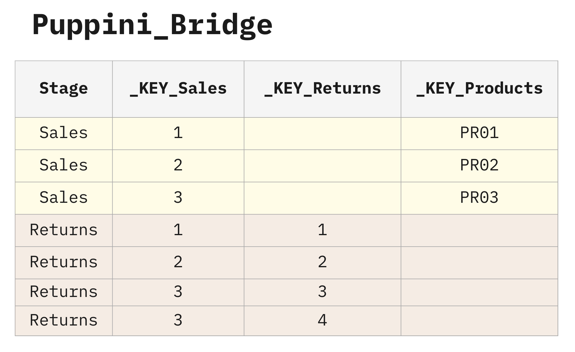
You can think of the Puppini Bridge as a central switchboard that has pre-connected all the records.
This makes a lot of sense because we typically know how these entities should be connected… There is no sense in making business users jump through hoops and read a manual about the data relationships if we can bake in the relationships to meet 90% of their use-cases.
Other attempts were made in the past to pre-connect all the tables, such as the “Universe” of SAP Business Objects. This solution was brilliant, but soon it turned out that different requirements needed different flavours of the Universe, organizing the tables in slightly different ways.
With the Unified Star Schema, the end-users always start a query with the Puppini Bridge, and then they add whatever table they need. They are no longer expected to know how to join the tables because this is already handled by the bridge. They are no longer expected to create chains of tables because the bridge resolves all the chains of tables.
Depending on the BI tool, tables will be connected either with a relationship (association) or with a LEFT JOIN. The key columns always have identical names, allowing most BI tools to automatically match them by default. With the vast majority of business requirements, the way to connect the tables remains the same.
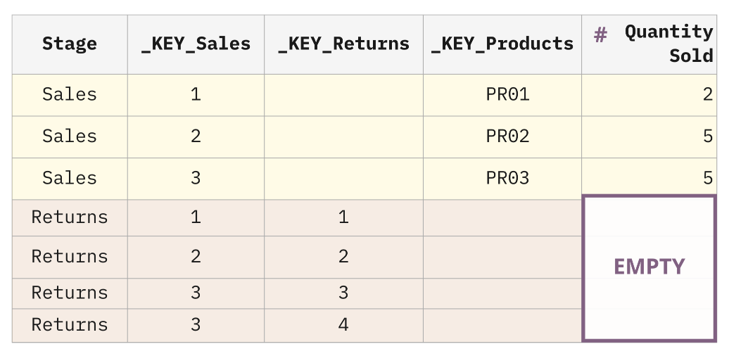
The Puppini Bridge is starting to look a lot like our target state! Unfortunately, this does not yet solve our fan trap problem because if we LEFT JOIN the Sales table into the bridge, we’ll actually end up accidentally mapping the Sales measures to the Returns rows as well.
To get to our desired state, we need to map the Sales measures to the appropriate rows in the Sales stage. We can do this by moving the measures to the bridge.
Note that this approach is only needed for the tables at risk of getting exploded by the fan trap. In our example, it is only needed for the Sales table. However, the approach can be optionally extended to Returns too.
In general, if all the measures are moved to the Puppini Bridge, the table will become a “super fact table.” The OLAP cubes, which are traditionally “mono-fact,” will seamlessly support the “multi-fact” scenario. Looker will no longer need to apply the “fanout formula,” which is very resource-intensive. Every BI tool, with a “super fact table,” will be able to go beyond its own limits.
Move Measures to the Bridge
In this approach, we take all tables at risk of explosion and embed their measures directly into the Puppini Bridge.
Notice that the Quantity Returned is not included in the Puppini Bridge because it was not at risk of explosion. That context can be brought in with a LEFT JOIN with the Returns table.
With this approach, you can filter Returns based on attributes from Sales, an operation that is not possible with traditional Kimball modelling.
How to Solve the Chasm Trap
With all that groundwork for building a Puppini Bridge behind us, we get this one for FREE!
Why?
The Unified Star Schema is safe from the chasm trap by definition because we build the Puppini Bridge using a UNION operation, which never generates duplicates.
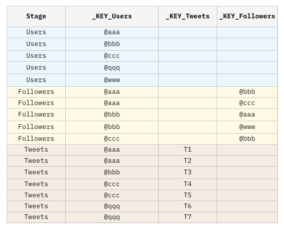
The Followers and Tweets tables do not point to each other in the bridge, so the chasm trap is avoided.
Note that also the Users stage has been included in the bridge, even if the Users table does not point to any table: this will ensure that all users will appear in the bridge, even if they have no followers and no tweets. This is called “Full Outer Join Effect”: although the end-users in the BI tool will create a LEFT JOIN, the result will rather look like a FULL OUTER JOIN.
Conclusion
I hope you now have a firm understanding of how the fan trap and chasm trap can introduce unwanted duplication in your analyses. You should now be able to quickly identify them solely by looking at the connection configuration of your tables.
This post would not have been possible without the learnings I gained from reading “The Unified Star Schema” and is only a small slice of what you will find in the book. If you want to dive deeper into this approach, I highly recommend buying a copy.
The book is very accessible and also explains how the Unified Star Schema solves other challenges such as loops, queries across multiple fact tables, and non-conformed granularities. In fact, Bill Inmon (the father of the data warehouse) wrote the first few chapters of the book, which should broaden the reach of these ideas.
If you have any questions about these concepts, feel free to reach out to me on LinkedIn. I will continue to cover this topic in greater detail, so make sure to subscribe to the newsletter to be notified of new articles.